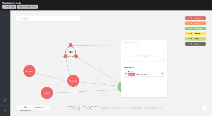
This thesis explores the topic of how one can streamline a data journalists analytical workflow in a graph visualization environment. Interactive graph visualizations have been used recently by data journalists to investigate the biggest leaks of data in history. Graph visualizations empower users to find patterns in their connected data, and as the world continuously produces more data, the more important it becomes to make sense of it. The exploration was done by conducting semi-structured interviews with users, which illuminated three categories of insights called Graph Readability, Charts in Graphs and Temporality. Graph Readability was the category that were conceptualized and designed by integrating user research and data visualization best practises. The design process was concluded with a usability test with graph visualization developers, followed by a final iteration of the concept. The outcome resulted in a module that lets users simplify their graph and preserve information by aggregating nodes with similar attributes.

